OreGrid
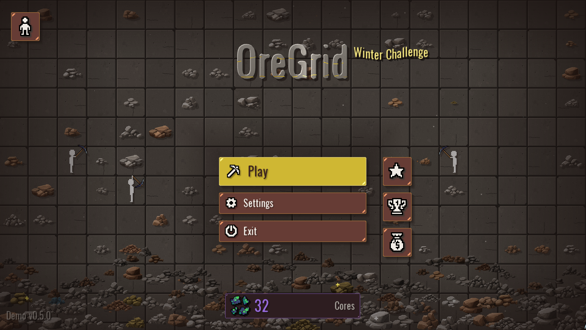
OreGrid is an idle mining game about breaking rock and building a quarry that grows with you.
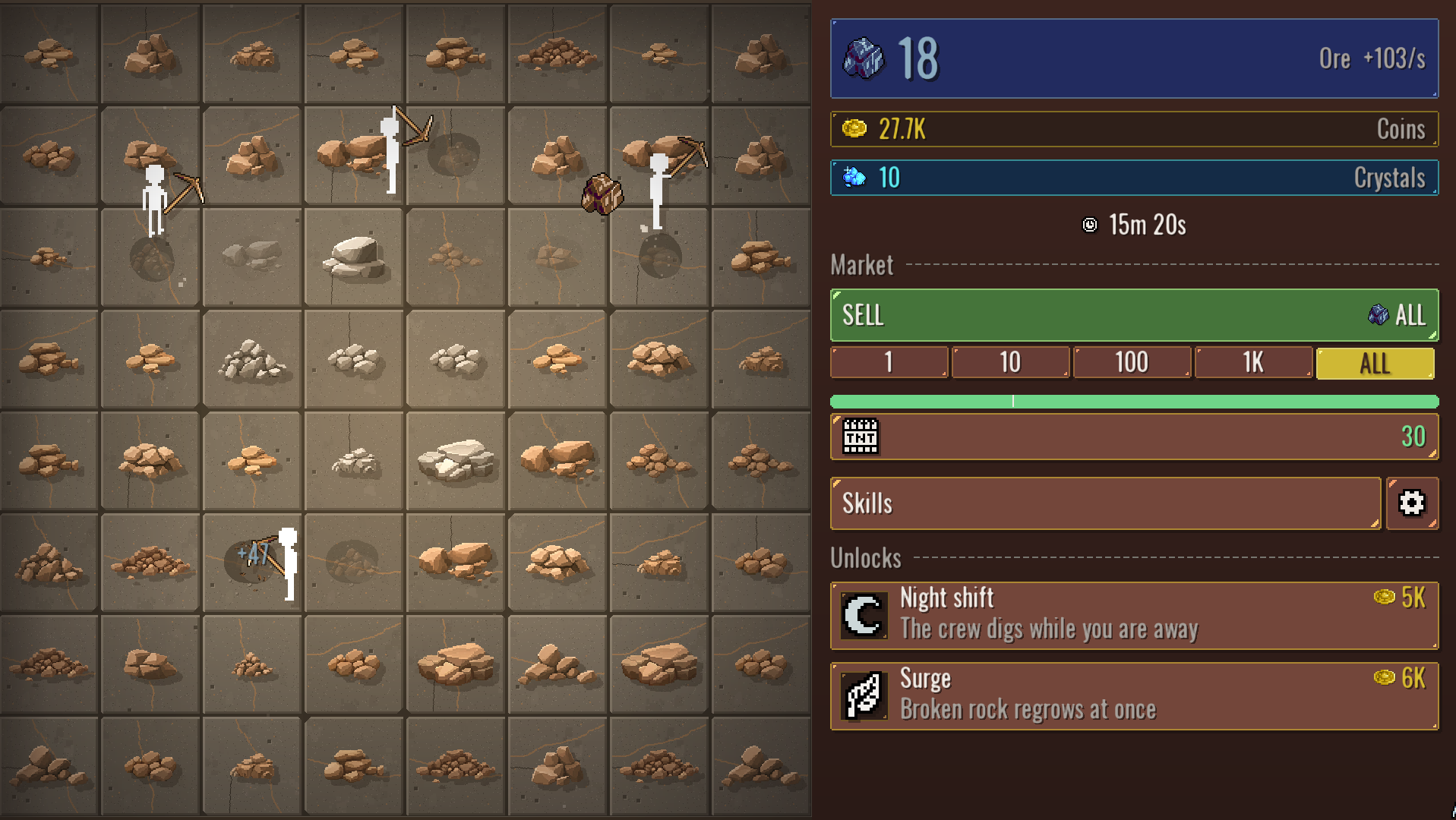
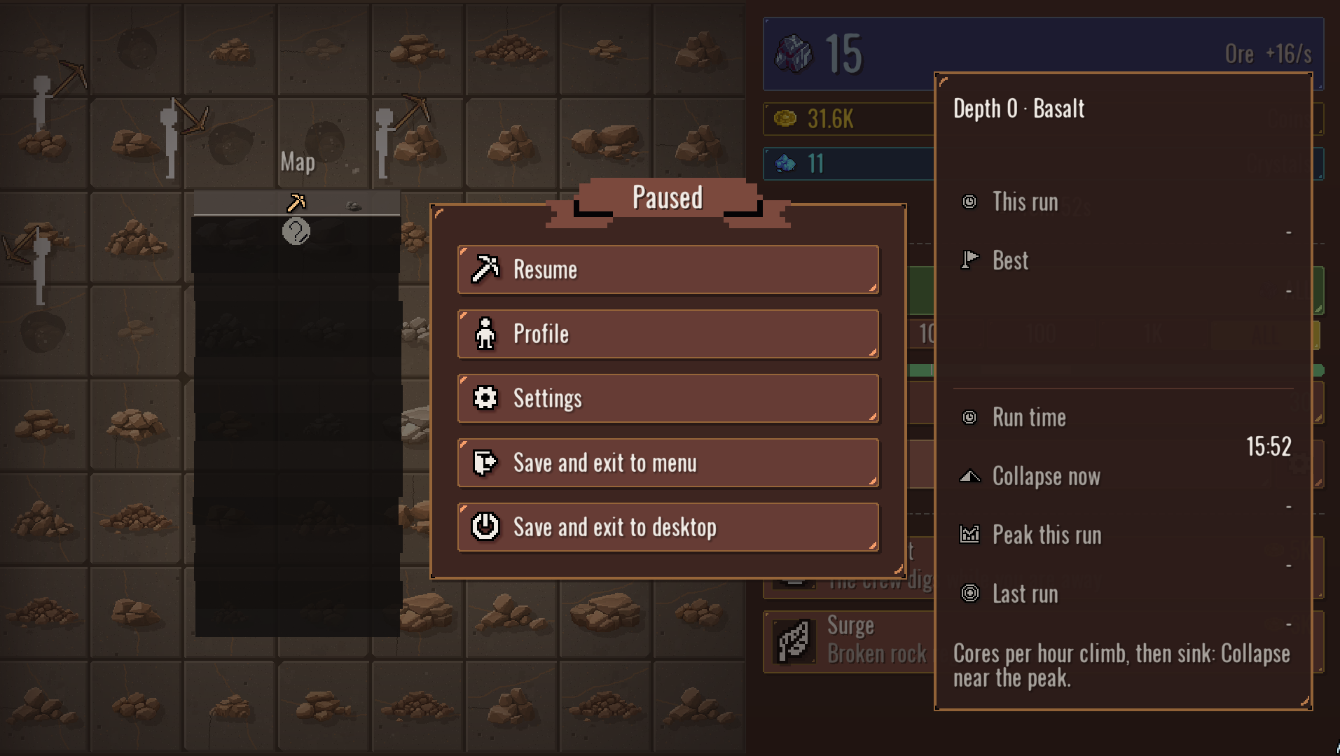
Grab the pickaxe, smash some stone, hire a crew and sell the ore! Push the dig to its limit, let it collapse, then start over, one level deeper. Keep your eye sharp and you might strike riches along the way. Unlock new skills, bring some patience and see where the path you carved leads.
Development log
- update + halloween2 days ago
Comments
Log in with itch.io to leave a comment.
I had a fun time playing this. The animations and screenshake made the mining feel very impactful. Like other people have mentioned, I had no idea there were challenges until AFTER I completed the game, which is a pretty big flaw IMO. I also REALLY enjoyed having to mine the upgrade buttons to unlock them, that was a fun and unique touch to the experience. I also appreciate how the upgrades felt like they had weight, the opposite of what I see happening with a lot of games like this.
I also took down some notes while playing the game and I'll just put them here for consideration (note: these are MY opinions, other people may disagree)
• Feels a little too repetitive overall for my tastes. However, it felt like a good middle ground between an idle game and the old Flash games of yesteryear
• 4x4 is a bit small for beginning, feels like a slog to get anywhere, especially before the first two collapses
• Why turn off auto-sell, then almost immediately give it back to the player with an upgrade? It didn't make much sense
• In the early game, being able to run out of rocks to mine feels stupid as if player is punished for selecting good upgrades or being too fast for the game to keep up
• After a collapse, you lose the ability to hover-click ores. As someone with wrist pain problems, this annoyed me greatly. Perhaps make it an accessibility option?
• Exiting upgrade menu is very annoying in the webpage version because you can't use the Esc button and the x button is super small compared to other buttons.
the game was very fun and I have an enjoyable time playing, though I would've liked to know that there's a separate shop in the main menu, didn't realize it exist until I finished the game.
Also, I'm having some mixed feelings with your definition of "clicks" I've finished the game with less than 700 clicks in total, and you have an achievement for clicking 1 trillion times. Is it intentional that the click & hold upgrade and the auto click doesn't count as individual clicks? because if so I can't see any way to get that 1 trillion clicks achievement legitamently. however, on the other hand, there's a challenge to get to 15x15 grid in 300 clicks or less, so it feels like it is intentional for the auto click to not count towards clicks... I'm confused in this part.
This last part is mostly just rant but, why do you also prevent us from continuing the completed save file? I want the satisfaction of buying out all the upgrades (even if they're not really useful anymore).
We have made an update
Nice
Thanks for playing our demo! Glad you enjoyed it.
Love the presentation and felt satisfying to play. It took me a little over 2hrs to reach the final depth and have everything upgraded.
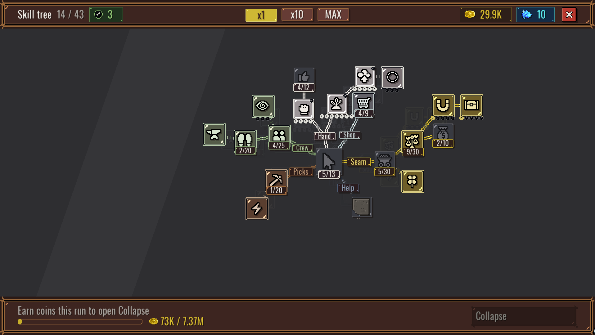
The main things I'd like to see adjusted is some of the UI/UX. Having the UI elements covered and the player needing to chip away the rocks is fun to star but having to do this every restart gets very tedious, even more so for the skill tree. I'd also have the skill tree nodes left uncovered as another user said as it can lead to mis-purchasing them.
It may also be a good idea on the cursor to have a point indicating where the exact cursor is. When mining rocks I can see a little + so I know this is implemented however on some menus it was a little awkward at times clicking slightly off as the pickaxe cursor doesn't display the exact click spot.
The talent tree nodes could be spaced apart slightly more as it did feel a bit cramped but that's more personal preference!
A+ job overall
Thanks for the detailed feedback and for playing to the final level. The points you mentioned are fixed in the new update, it is coming very soon.
If holding click while moving mouse out of the game scene, you can release click, and the pickaxe will still act like it is being clicked when mouse is moved back.
Good game so far.
Thanks for the report. The click issue is fixed in the new update, along with other things.
It’s better to leave upgrades uncovered to prevent accidental purchases
Thank you for noticing! We'll see about this in the next update, it will be made tomorrow.